| Entrance | Mainstreet | Wiki | Register |
|
# of watchers: 13
| D20: 8 |
| Wiki-page rating |  Stumble! Stumble! |
| Informative: | 0 |
| Artistic: | 0 |
| Funny-rating: | 0 |
| Friendly: | 0 |

2010-04-02 [Teufelsweib]: is this seriously digital? :O it looks so much like a painting! I love the greens <3
2010-04-02 [NOOOPE]: I really love the more suggestive moments, like her front foot fading into her shoe and her dress on the darker left side. I also love how the shadows are so purpley. The only thing that I think could be better is the distinct lines on her hands, chest and face. Everything else has such gradual tone/shading shifts, but those lines are more abrupt, ya know?
2010-04-02 [Chel.]: Yea... I know. :/ Old habit I suppose.
2010-04-02 [Aeolynn]: Since my favorite color is green, this instantly appeals to me. The only thing I think is a little off are her eyes. The color seems to fade into the background, and her hair... maybe make her eyes lime? XD
2010-04-02 [windowframe]: I love how the lemons are the light source, it looks as if they're orbiting her like small moons. :3
2010-04-02 [Yami]: It's beautiful! I wish I could just get my hands on photoshop
2010-04-03 [Chel.]: Aeo: Ohh.... I like that idea about the eye color!
Silver: It's SO AWESOME that you noticed.
2010-04-04 [Daisy_Sandybanks]: Very nice!
I love the exaggerated style of her pose.
Yes, I love that the piece looks like it was made with traditional media, when in fact it's not.
Well done. :)
2010-04-05 [Chel.]: New pic up!
2010-04-05 [NOOOPE]: Awesome!! But where is her other wing, I wonder...
2010-04-05 [Chel.]: Yea..I've been avoiding it...
2010-04-06 [Aeolynn]: Just have it fold down, next to her knees, so that its mostly covered by hair~ XD
2010-04-06 [Chel.]: Yea, that's sort of how I've been placing it... :P
2010-04-06 [NOOOPE]: Well, her other shoulder is more forwards... so it'd come to a peak behind and above her head and then settle near her ankles, I'd think...
2010-04-06 [Chel.]: NEW PIC!
2010-04-06 [Teufelsweib]: ha ^^ I'm too bad to see the difference between the two kinds of paint, but especially the pencil looks great! I still can't believe this is digital xD
2010-04-06 [NOOOPE]: Awesome. Though watercolor/oil dun really look like that too much, this pic is still awesome so screw any nit picking.
2010-04-06 [Chel.]: Dude...it was difficult. >_>' Pencil was the easiest...
2010-04-06 [Daisy_Sandybanks]: I like them! Very well done. Making digital media look like tradition media is extremely hard, but you did a fantastic job on these!
I especially love the charcoal one, I love the little details that you added to it to make it look like charcoal (the smudges and whatnot).
2010-04-06 [Chel.]: Thanks hun!
2010-04-07 [Aeolynn]: I think they all look convincing enough to appear as the modeled mediums :]
2010-04-07 [Chel.]: The charcoal turned out looking more like an ink wash..
2010-04-18 [Chel.]: NEW.
2010-04-19 [NOOOPE]: Oooo, I like! I like the day and night ones the best. The evening one isn't as convincing to me, but I can't figure why...
2010-04-19 [Chel.]: Yea...that one is weird to me too. I think the purple throws me off. It should be more... red and orange.
2010-04-19 [Keylla]: Amazing work with the colors! My favorite is Dusk ;D (and I dont see anything wrong with the purple in it, it works)
2010-04-19 [Aeolynn]: I like the night one the most, just has a nice aura to it :]
2010-04-20 [Daisy_Sandybanks]: The day one has to be my least favorite, oddly enough. That may be due to the fact that I love darker tones though.
Overall, very well done! :)
2010-04-20 [Chel.]: I like the night one too, it's probably going to be the one i pick for my final
...i think the day one is really clishe.
2010-04-22 [Chel.]: new image, yo.
2010-04-22 [Chel.]: For me, it was between the top right and bottom left.... went with bottom left.
2010-04-22 [NOOOPE]: AH! I just wrote you this big comment about how they look too much like flappers, not noticing that was the point... I feel stupid.
And I like the last one, but, uh, too late.
2010-04-23 [Daisy_Sandybanks]: Oh, I love it!
I love the colors, very vibrant.
2010-04-23 [Chel.]: What aspects do you like? This is really just a rough. I can change it in the real composition.
2010-04-23 [NOOOPE]: What do I like? With the last one, I feel the flapper element doesn't take over. With the ones on the left, flapper is the first thing I saw. With the last one it's there, but it's subtle. Plus, she has a very adorable expression. Very playful.
2010-04-23 [Chel.]: I thought the last one almost gave out a "Egyptian" vibe....
2010-04-26 [pegasus1000]: I like the color and costumes. They are very nice and playful. In the full body pic It looks like her hand is as big as her head (Kinda odd to me). Do you have full body shots of all four? It would be nice to see.
2010-05-06 [Daisy_Sandybanks]: I love them!
Very colorful and bright. Would definitely get the customer attention.
Why do the Lemon Chalet ones have a praying mantis on the back though? I hope they're not made out of them. ;)
2010-05-06 [Chel.]: Haha! XD
2010-05-06 [NOOOPE]: Freakin sweet. Awesomely professional and adorable
2010-05-07 [pegasus1000]: Makes me smile looking at them.
2010-05-07 [Chel.]: What happened to the feedback? I know I'm not that amazing.
2010-05-07 [NOOOPE]: What? We're allowed to just say we like 'em if we can't find any fault with them. This isn't a critique wiki. If we feel it's necessary to critique, then we can, but if we don't, then we're not obligated to. Saying we like it IS feedback.
2010-05-08 [Chel.]: Yea- I suppose.
But I do think there is never something not to crit.
2010-05-11 [pegasus1000]: If you insist. I wish you had kept the large pics of the cookies on the front of the box. Girl Scout cookies are usually placed on tables when sold. If you are trying to get a new customer that person will want to see the cookies. Even Returning customers are drawn to their beloved cookies and ignore the rest. To me one cookie is NEVER enough.
Where is the Girl Scout motto? Courage Confidence Character
2010-05-11 [Chel.]: Motto and cookie is on the side.
To counter that, my whole thing was that the current boxes seem to be all about the cookies. Which really isn't the important thing. Sure they are delicious- but that shouldn't be the real reason to buy from a girl scout.
My boxes are more about what the profits go towards and not so much about the cookies. Each box has written on the back where the money goes to. "The profits made from this box goes towards teaching girls nutrition..." etc etc
2010-05-12 [pegasus1000]: Think of it in cereal terms. You always see pictures of the cereal, even Shredded Wheat. I think the only exception would be Wheaties. Shoppers want to see the product on the front the back of the box is for other material (Games, what the product goes to and so on.)
You do have shelf appeal. Yes your boxes are cute and tell people what the funds go to, (I would bye it, Major props) but you give me one cookie and it is on the side. It is the one thing I had grief with.
2010-05-12 [Chel.]: Interesting... Thanks a lot!
2010-05-17 [arthemis_]: Oh I do adore the design, very comic/tv-showl
2010-05-20 [The Dizzy Raven]: haha!!! :D i love it!!! not many artists these days do designs like that. :) *thumbs up*
2010-05-20 [Falx]: Okay, now there are some girl scout cookie boxes I wouldn't have minded shoving off on a few people. I think the best part about this is how the designs look like something little kids should be selling. The cartoonish quality is really very sweet.
2010-06-10 [Chel.]: New.
2010-06-10 [Aeolynn]: I really like the colors, and overall flow of this piece, however some definition lines are bugging me. The colors separating her thighs is the main one, seems like there needs to be more of a contrast, or it might just be this shitty school comp monitor.
Lol...
2010-06-10 [Chel.]: No, they need to be more defined.... otherwise at a glance it looks like one fat thigh.... thanks Aeo! <3
2010-06-10 [Aeolynn]: <3
2010-06-11 [arthemis_]: Oh wow! I don't have any critiques here, I simply love it!
2010-06-12 [Teufelsweib]: it's so cuuuuute ^^
2010-06-13 [pegasus1000]: This picture is supper cute and I love it, for a cartoon it is perfect. The colors and shading of the skin are great. I love the flower in her hair and the short feathers between the wings and her back. If you are trying for realistic proportions: Where the top falls in the front is too high up, as it is the top would be covering her caller bones and just barely cover her nipples. Perhaps you should just consider lengthening that area just a little. The hands could be a little longer too, as long as the feet. Great job.
2010-06-13 [Aeolynn]: hands are never as long as feet =P
2010-06-13 [Chel.]: A realistic hand should be as big as one's face....but I'm not really going that realistic...as you can tell from the noodle arms. :P
2010-06-14 [Chel.]: NEW SORTA.
2010-06-14 [Aeolynn]: little smudge on her leg
2010-06-14 [Chel.]: Fixed....uhh right?
2010-06-14 [Chel.]: Heh....I like opening the two images and flicking them back and forth to see the progress.
2010-06-14 [arthemis_]: Hey, now she has breasts :P
2010-06-14 [Chel.]: Haha! XD
2010-06-16 [arthemis_]: and highlighted clothes... :P
2010-06-16 [Chel.]: I changed her proportions the most.
2010-06-22 [Chel.]: A lil different but.. NEW
2010-06-22 [NOOOPE]: I like the top left best. You're too colorful a person for black or white and the top one feels more balanced than the one below it.
2010-06-22 [Aeolynn]: I like the teal one the most XD
2010-06-24 [pegasus1000]: I like the top left as well. The pics look matted. And for a former picture framer that is always a good thing.
2010-06-24 [Falx]: I like the top left and the middle right ones the best. I feel like I'm losing the thumbnails on the others. For web design, the top left would be easier on the eyes. I just like the middle right one because the black background really makes the thumbnails pop out.
2010-06-25 [arthemis_]: I like the down left the most :) Overall it's a good design.
2010-06-26 [Chel.]: NEW.
2010-06-27 [Chel.]: ...?
2010-06-27 [arthemis_]: Cool... Though I find the black raster background a bit distracting because it's sooo much of it...
2010-06-28 [Chel.]: Yeaa....I'm worried about that and how it will look like when scrolling.
2010-06-28 [Falx]: I'm with arthemis on this. Though, what I really dig is the bazooka chick. Original reaction was *blink blink* "Roller skates? Awesome!"
2010-06-28 [Chel.]: Yea, this was my original: http://elftown
But for the sake of my site, I needed the colors to be more "cute"
2010-06-29 [NOOOPE]: I think the colors in this one clash a little too much. The greens pop out to much and sorta pull things apart.
2010-06-29 [Chel.]: Alright, I can work on the green...
2010-06-29 [arthemis_]: Wouldn't it be a good idea to involve the colors you used for the text into the image? The blue of the text instead of the green and the yellow more in the gunfire or the helmet?
2010-06-29 [Chel.]: The yellow is from the fire and the teal is from her hair....
2010-06-29 [Chel.]: My color pallet is teal, yellow-green, coral and purple.
2010-06-29 [Aeolynn]: Have you tried making the yellow text more of the orange of her star? The yellow just doesn't seem to pop as much as it could
2010-06-29 [Chel.]: Perhaps perhaps... also, the rollover text will also be a corresponding color.
2010-06-30 [Chel.]: bleh new?
2010-07-07 [Daisy_Sandybanks]: YES! Toy Story!
Awesome. :)
I love the colors you've used and the fact that it has a simple background. I dont like how the cow patterned ... boots (?) are outlined/more bold than the rest of her ... It makes them stand out too much from the rest of the image.
2010-07-11 [pegasus1000]: Very cute I think the hand to the side could use some work.
2010-07-11 [Aeolynn]: I really like the rustlike texture on the whole thing :]
2010-07-13 [Chel.]: new
2010-07-13 [Aeolynn]: I don't like the lavender on that 3rd panel, I think you should stick with your orange/green theme for that.
Also I know the black isn't "you" but I think it looks good here
2010-07-13 [Chel.]: A reason I stuck with black/grey was so that the thumbnails would pop.
2010-07-13 [Aeolynn]: and very rightly so, they look very good :)
2010-07-13 [pegasus1000]: I like it and for a site page it is very streightforwar
2010-07-13 [Chel.]: i want it to be. I've read that clients get pissed when they are directed to a confusing site.
2010-07-14 [NOOOPE]: I like the black bubble top in the first one, and really like how cannon girl fits into this new color scheme. The BG pattern is nice too... The top left's top is the one I like best.
2010-07-14 [Aeolynn]: Yes yes, I agree with M!
2010-07-14 [Chel.]: what about the new polka dot one?
2010-07-16 [Aeolynn]: I definitely like this one a lot better then the tiny polkadots
2010-07-16 [Chel.]: me too!
2010-07-16 [Chel.]: NEW
2010-07-16 [Daisy_Sandybanks]: I like it. Great colors. Nice pose. The feet seem like they're kinda at an odd angle though.
2010-07-17 [Aeolynn]: unless she just broke her legs while being a NINJA!!!!!!!!!
2010-07-17 [Falx]: I like it! The hand seems kind of odd to me, but I think it's just my screen resolution because it looks like she only has one finger.
I love the colors! Hurray for cherry trees!
2010-07-17 [Daisy_Sandybanks]: Oh, bandage on the knee .. Right. Broken leg. Ok, I get it, heh.
2010-07-18 [pegasus1000]: I like the way it seems she is actually in a tree without all the detail of the tree. Cool.
2010-08-29 [Chel.]: NEW. Last art of the summer!
2010-09-09 [Chel.]: VOTE please?
2010-10-01 [Ravendust]: cute, as a lot of your art has been :) I did go ahead and give a vote
2010-10-02 [Daisy_Sandybanks]: Love them all, except the water guns one ... I don't know if it's my dirty mind or what, but they look too erotic for some reason, heh. o_o
2010-10-03 [Daisy_Sandybanks]: Love it! Classy, yet simple. Love the colors.
2010-10-03 [Chel.]: Thanks! I tried to pick colors that you find in my work a lot.
2010-10-06 [Daisy_Sandybanks]: Very cool. Again, love thecolors, haha. Is thisthe finished product or is it still a work in progress? I feel like a little something more could be added to it. Not sure what though ... Maybe some texture (fur or something) on the bat?
2010-10-06 [Chel.]: No, it's done. I wanted to keep everything relatively "semi-flat". I did have a few little hairs on the bat's chin and nose but....it looked weird and I got rid of it.
2010-10-07 [pegasus1000]: The bat is trying to eat the moon. What a cool pic for holloween.
2010-10-07 [NOOOPE]: Wowsa! Awesome!
2010-10-07 [Daisy_Sandybanks]: Yeah, simple is probably better.
2010-10-07 [Ravendust]: uber cute :3
2010-10-07 [NOOOPE]: My only suggestion would be to make the back hill cooler. It would suggest atmospheric perspective, cut down on the violent magenta and still keep things simple.
2010-10-07 [Aeolynn]: The contrast of colors is very nice :)
2010-10-12 [The Dizzy Raven]: Wahoo! lol there's that bat I commented on not that long ago. XD good times. Once again, awesome job Chel!
2010-10-27 [Chel.]: new.
2010-10-28 [pegasus1000]: It's cute. A girl’s coffee if ever there was one. Makes me think of... cookies (biscotti to be exact). I like to coffee cups on the first and third pic, but I couldn’t see one on the second. Nice job on the whole piece.
2010-10-28 [Ravendust]: very interesting, cute, I like :)
2010-10-28 [The Dizzy Raven]: Chicago! I love chicago.
anyways... lol I love the art. :) very cutesy
2010-11-08 [Chel.]: NEW.
2010-11-08 [Aeolynn]: Clever :) I really like the choice of colors, and especially how transparent the membranes look
2010-11-08 [pegasus1000]: I like the concept, especially that the male and female are different colors and have atomical differences as one would see in nature. I agree with [Aeolynn] on her statement of the membrane being transparent, which is just cool.
On the side of physics: It the fluito were gliding from a treetop and decided to curl its tail underneath it the animal would fall faster and negate any additional air added from the tail. (Unless it is a lot of high-pressure air, and by the size of the ball it’s not enough.).
2010-11-08 [Chel.]: It puffs up like an erection and expels hot air up... like a hot air balloon. It was the only thing I could think of. So I am stretching the truth a bit considering it's a fantasy painting class XD
2010-11-09 [pegasus1000]: It is a cool idea.
2010-11-14 [Chel.]: ...new?
2010-11-15 [Aeolynn]: For almost every picture having a rotund fruit, they all seem very unique, and fitting their color scheme :)
2010-11-15 [Chel.]: Omg- I never even thought of that... (that they are mostly circle.)
I couldn't think of any cute phrases for strawberries, pineapples or pears...
2010-11-15 [pegasus1000]: I can only think of phrases for peaches. (Everything is peachy keen.) This is SO cute. I love it. I would buy it for children learning their fruits or for a cute children’s poster, or even for magnets... Ya, lots you can do with this.
I do have a few things to say about the piece. The fruit is circular... Fruit has some shape especially where the stem is. Since this is a color study that doesn’t matter.
So for the color aspect of this piece… The one that is the most different to me is the apple one. The background is darker then the fruit where as in all of the others it is lighter, I know you already had pink, but it stands out. Anyway the only other comment I would make is that the oranges blind in, especially the one in the boy’s hand. But that might just be from the placement of the umbrella logo over it.
2010-11-15 [Aeolynn]: I agree, the oranges do seem to blend in with everything in that one
2010-11-15 [Chel.]: Yea, I forgot the 'y' in Peachy.
And yes I agree that the buy sort of blends into the peach one. His skin is a bit too close to the background too.
2010-11-15 [Chel.]: The Peach kid looks like he is juggling butts.
2010-11-20 [Ravendust]: these are all extremely adorable, I love them :)
2010-11-20 [Chel.]: New. Thought you guys might enjoy seeing the final compared to the sketches.
2010-11-20 [Ravendust]: oh, definite difference, the images are sharper (probably due to the outlining xD) and it makes a world of a difference, awesome job
2010-11-20 [Chel.]: Plum and Cherry are really the only two that stayed really close to the original.
2010-11-20 [Ravendust]: the others changed for the better, though, Plum and Cherry were already well done from the start
2010-11-20 [Chel.]: Agreed! :3 Thanks hun.
2010-11-20 [Chel.]: Also- curious...what ethnicity does the peach kid look like to you guys? I couldn't pin it exactly when I was doing it.
2010-11-20 [Ravendust]: my guess would be something close to hispanic :-/
2010-11-21 [The Dizzy Raven]: Cute! :D
2010-11-22 [pegasus1000]: He is obviously from Guam. 8~)
He is very cute. I like the new look. It seems more finished.
2010-11-22 [Aeolynn]: manny: the banana girl should be driving a banana wheel! I really like these new versions, and the color scheme is perfect :)
2011-08-10 [Eyonic]: it's so cute!!
2011-10-26 [pegasus1000]: It's been a few months and I had started to winder if perhaps my computer had glitched... Nope, still the same really adorable picture. I still love it.
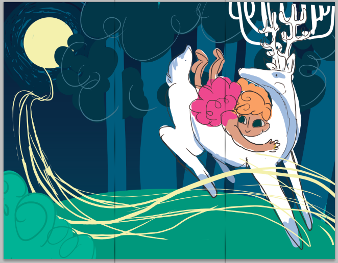
2011-10-26 [pegasus1000]: It's really cute. The antlers really look like a chandelier. I really like the dream like quality you put into this picture. I'm not really sure what kind of job you are going for but I am sure this would put variety in your brochure.
2011-10-26 [Chel.]: Well I wanted to show how I illustrate people, animals and an environment. Design aspects will be on the flip side of the brochure.
2011-10-26 [pegasus1000]: Cool. I have always liked your design style. It has a vintage (40-50's Felix the Cat or Little Lulu era) flair that is still unique to your own view point. I really hope you get the job you are going for.
2011-10-26 [Chel.]: I'm probably going to be sending this out to 50 places or so all over the US. XD Cross your fingers!
2011-11-14 [Ravendust]: cute :)
2011-11-14 [Chel.]: update
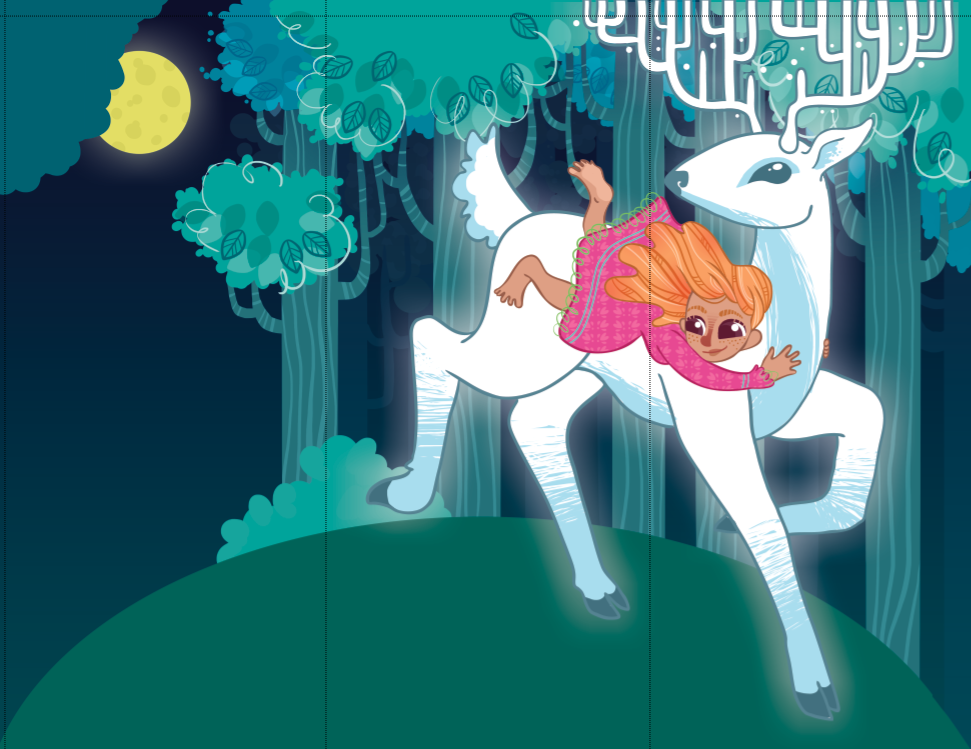
2011-11-14 [pegasus1000]: nice. I think I like the face on the original better. The nose on the new one looks brown. Still very cute.
2011-11-18 [Eyonic]: i love the leaves on the tree with the 'squiggle' line effect together. over all a nice brochure :)
2011-11-18 [Chel.]: I dont know what to put in the moonlight glow ribbon....I was thinking fish or general forest animals...sugg
2011-11-18 [Aeolynn]: ah... final is much nicer then the WIP, you're getting better at drawing animals!
2011-11-18 [Chel.]: Thats not the final yet... its still a WIP
2011-11-18 [Aeolynn]: the first wip then.
2011-11-18 [Chel.]: I need to do sky details, grass details and the moonlight thing when I figure it out
2011-11-18 [Ravendust]: I think general forest animals is a neat idea, maybe progressively smaller animal types the closer to the moon?
2011-11-18 [Chel.]: Hahahahh!!! Magical power albinos!
When I was coloring, it kept reminding me of a partonus.
2011-11-18 [NOOOPE]: They aren't actually albino. It's a different type of genetic situation. They are simply white. 'Least, that's what reddit told me.
2011-11-18 [Chel.]: Kind of a shitty genetic trait if you ask me. Camouflage just goes out the window....unle
2011-11-18 [pegasus1000]: Bad for camouflage but they sure are pretty.
At least they don't glow like your dear. ;~)
2011-11-19 [Ravendust]: by the way, apparently I haven't seen you're update for the wip, my computer's been kinda sucky using the net from my phone and it never loaded. Absolutely AMAZING Chel :)
| Show these comments on your site |
|
Elftown - Wiki, forums, community and friendship.
|